布局解决方案
了解 CSS 中属性的值及其特性, 透彻分析问题和需求才可以选择和设计最适合的布局解决方案。
居中布局
水平居中

子元素于父元素水平居中且其(子元素与父元素)宽度均可变。
inline-block + text-align
<div class="parent">
  <div class="child">Demo</div>
</div>

<style>
  .child {
    display: inline-block;
  }
  .parent {
    text-align: center;
  }
</style>
优点
- 兼容性佳(甚至可以兼容 IE 6 和 IE 7)
table + margin
<div class="parent">
  <div class="child">Demo</div>
</div>

<style>
  .child {
    display: table;
    margin: 0 auto;
  }
</style>
NOTE: display: table 在表现上类似 block 元素,但是宽度为内容宽。
优点
- 无需设置父元素样式 (支持 IE 8 及其以上版本)
NOTE:兼容 IE 8 一下版本需要调整为 <table> 的结果
absolute + transform
<div class="parent">
  <div class="child">Demo</div>
</div>

<style>
  .parent {
    position: relative;
  }
  .child {
    position: absolute;
    left: 50%;
    transform: translateX(-50%);
  }
</style>
优点
- 绝对定位脱离文档流,不会对后续元素的布局造成影响。
缺点
transform为 CSS3 属性,有兼容性问题
flex + justify-content
<div class="parent">
  <div class="child">Demo</div>
</div>

<style>
  .parent {
    display: flex;
    justify-content: center;
  }

  /* 或者下面的方法,可以达到一样的效果 */

  .parent {
    display: flex;
  }
  .child {
    margin: 0 auto;
  }
</style>
优点
- 只需设置父节点属性,无需设置子元素
缺点
- 有兼容性问题
垂直居中

子元素于父元素垂直居中且其(子元素与父元素)高度均可变。
table-cell + vertical-align
<div class="parent">
  <div class="child">Demo</div>
</div>

<style>
  .parent {
    display: table-cell;
    vertical-align: middle;
  }
</style>
优点
- 兼容性好(支持 IE 8,以下版本需要调整页面结构至
table)
absolute + transform
<div class="parent">
  <div class="child">Demo</div>
</div>

<style>
  .parent {
    position: relative;
  }
  .child {
    position: absolute;
    top: 50%;
    transform: translateY(-50%);
  }
</style>
优点
- 绝对定位脱离文档流,不会对后续元素的布局造成影响。但如果绝对定位元素是唯一的元素则父元素也会失去高度。
缺点
transform为 CSS3 属性,有兼容性问题
flex + align-items
<div class="parent">
  <div class="child">Demo</div>
</div>

<style>
  .parent {
    display: flex;
    align-items: center;
  }
</style>
优点
- 只需设置父节点属性,无需设置子元素
缺点
- 有兼容性问题
水平与垂直居中
子元素于父元素垂直及水平居中且其(子元素与父元素)高度宽度均可变。
inline-block + text-align + table-cell + vertical-align
<div class="parent">
  <div class="child">Demo</div>
</div>

<style>
  .parent {
    text-align: center;
    display: table-cell;
    vertical-align: middle;
  }
  .child {
    display: inline-block;
  }
</style>
优点
- 兼容性好
absolute + transform
<div class="parent">
  <div class="child">Demo</div>
</div>

<style>
  .parent {
    position: relative;
  }
  .child {
    position: absolute;
    left: 50%;
    top: 50%;
    transform: translate(-50%, -50%);
  }
</style>
优点
- 绝对定位脱离文档流,不会对后续元素的布局造成影响。
缺点
transform为 CSS3 属性,有兼容性问题
flex + justify-content + align-items
<div class="parent">
  <div class="child">Demo</div>
</div>

<style>
  .parent {
    display: flex;
    justify-content: center;
    align-items: center;
  }
</style>
优点
- 只需设置父节点属性,无需设置子元素
缺点
- 有兼容性问题
多列布局
多列布局在网页中非常常见(例如两列布局),多列布局可以是两列定宽,一列自适应, 或者多列不定宽一列自适应还有等分布局等。
一列定宽,一列自适应

float + margin
<div class="parent">
  <div class="left">
    <p>left</p>
  </div>
  <div class="right">
    <p>right</p>
    <p>right</p>
  </div>
</div>

<style>
  .left {
    float: left;
    width: 100px;
  }
  .right {
    margin-left: 100px
    /*间距可再加入 margin-left */
  }
</style>
NOTE:IE 6 中会有3像素的 BUG,解决方法可以在 .left
加入 margin-left:-3px。
float + margin + (fix) 改造版
<div class="parent">
  <div class="left">
    <p>left</p>
  </div>
  <div class="right-fix">
    <div class="right">
      <p>right</p>
      <p>right</p>
    </div>
  </div>
</div>

<style>
  .left {
    float: left;
    width: 100px;
  }
  .right-fix {
    float: right;
    width: 100%;
    margin-left: -100px;
  }
  .right {
    margin-left: 100px
    /*间距可再加入 margin-left */
  }
</style>
NOTE:此方法不会存在 IE 6 中3像素的 BUG,但 .left 不可选择,
需要设置 .left {position: relative} 来提高层级。
此方法可以适用于多版本浏览器(包括 IE6)。缺点是多余的 HTML 文本结构。
float + overflow
<div class="parent">
  <div class="left">
    <p>left</p>
  </div>
  <div class="right">
    <p>right</p>
    <p>right</p>
  </div>
</div>

<style>
  .left {
    float: left;
    width: 100px;
  }
  .right {
    overflow: hidden;
  }
</style>
设置 overflow: hidden 会触发
BFC 模式(Block Formatting Context)块级格式化文本。
BFC 中的内容与外界的元素是隔离的。
优点
- 样式简单
缺点
- 不支持 IE 6
table
<div class="parent">
  <div class="left">
    <p>left</p>
  </div>
  <div class="right">
    <p>right</p>
    <p>right</p>
  </div>
</div>

<style>
  .parent {
    display: table;
    width: 100%;
    table-layout: fixed;
  }
  .left {
    display: table-cell;
    width: 100px;
  }
  .right {
    display: table-cell;
    /*宽度为剩余宽度*/
  }
</style>
table 的显示特性为每列的单元格宽度合一定等与表格宽度。
table-layout: fixed; 可加速渲染,也是设定布局优先。
NOTE:table-cell 中不可以设置 margin 但是可以通过 padding 来设置间距。
flex
<div class="parent">
  <div class="left">
    <p>left</p>
  </div>
  <div class="right">
    <p>right</p>
    <p>right</p>
  </div>
</div>

<style>
  .parent {
    display: flex;
  }
  .left {
    width: 100px;
    margin-left: 20px;
  }
  .right {
    flex: 1;
    /*等价于*/
    /*flex: 1 1 0;*/
  }
</style>NOTE:flex-item 默认为内容宽度。
缺点
- 低版本浏览器兼容问题
- 性能问题,只适合小范围布局。
两列定宽,一列自适应

<div class="parent">
  <div class="left">
    <p>left</p>
  </div>
  <div class="center">
    <p>center<p>
  </div>
  <div class="right">
    <p>right</p>
    <p>right</p>
  </div>
</div>

<style>
  .left, .center {
    float: left;
    width: 100px;
    margin-right: 20px;
  }
  .right {
    overflow: hidden;
    /*等价于*/
    /*flex: 1 1 0;*/
  }
</style>
多列定宽的实现可以更具单列定宽的例子进行修改与实现。
一列不定宽加一列自适应

不定宽的宽度为内容决定,下面为可以实现此效果的方法:
float+overflow,此方法在 IE6 中有兼容性问题table,此方法在 IE6 中有兼容性问题flex,此方法在 IE9及其以下版本中有兼容性问题
多列不定宽加一列自适应
其解决方案同一列不定宽加一列自适应相仿。
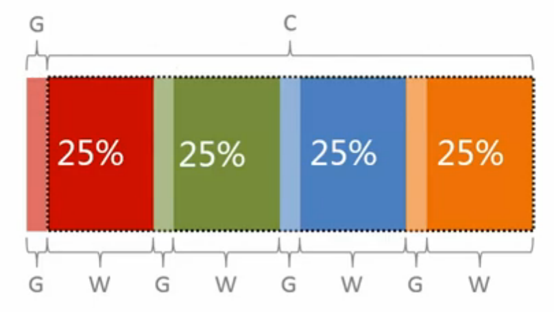
多列等分布局
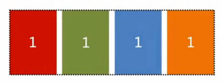
每一列的宽度和间距均相等,下面为多列等分布局的布局特定。

父容器宽度为 C,C = W * N + G * N - G => C + G = (W + G) * N。
float

<div class="parent">
  <div class="column">
    <p>1</p>
  </div>
  <div class="column">
    <p>2</p>
  </div>
  <div class="column">
    <p>3</p>
  </div>
  <div class="column">
    <p>4</p>
  </div>
</div>
<style media="screen">
  .parent {
    margin-left: -20px;
  }
  .column {
    float: left;
    width: 25%;
    padding-left: 20px;
    box-sizing: border-box;
  }
</style>
NOTE:此方法可以完美兼容 IE8 以上版本。 NOTE+:此方法结构和样式具有耦合性。
table
<div class='parent-fix'>
  <div class="parent">
    <div class="column">
      <p>1</p>
    </div>
    <div class="column">
      <p>2</p>
    </div>
    <div class="column">
      <p>3</p>
    </div>
    <div class="column">
      <p>4</p>
    </div>
  </div>
</div>

<style media="screen">
  .parent-fix {
    margin-left: -20px;
  }
  .parent {
    display: table;
    width: 100%;
    /*可以布局优先,也可以单元格宽度平分在没有设置的情况下*/
    table-layout: fixed;
  }
  .column {
    display: table-cell;
    padding-left: 20px;
  }
</style>
NOTE:缺点是多了文本结果
flex
<div class="parent">
  <div class="column">
    <p>1</p>
  </div>
  <div class="column">
    <p>2</p>
  </div>
  <div class="column">
    <p>3</p>
  </div>
  <div class="column">
    <p>4</p>
  </div>
</div>

<style media="screen">
  .parent {
    display: flex;
  }
  .column {
    /*等价于 flex: 1 1 0;*/
    flex: 1;
  }
  .column+.column {
    margin-left: 20px;
  }
</style>NOTE:flex 的特性为分配剩余空间。
NOTE+:兼容性有问题。
table
table 的特性为每列等宽,每行等高可以用于解决此需求。
<div class="parent">
  <div class="left">
    <p>left</p>
  </div>
  <div class="right">
    <p>right</p>
    <p>right</p>
  </div>
</div>

<style>
  .parent {
    display: table;
    width: 100%;
    table-layout: fixed;
  }
  .left {
    display: table-cell;
    width: 100px;
  }
  .right {
    display: table-cell;
    /*宽度为剩余宽度*/
  }
</style>
flex
<div class="parent">
  <div class="left">
    <p>left</p>
  </div>
  <div class="right">
    <p>right</p>
    <p>right</p>
  </div>
</div>

<style>
  .parent {
    display: flex;
  }
  .left {
    width: 100px;
    margin-left: 20px;
  }
  .right {
    flex: 1;
    /*等价于*/
    /*flex: 1 1 0;*/
  }
</style>
NOTE:flex 默认的 align-items 的值为 stretch。
float
<div class="parent">
  <div class="left">
    <p>left</p>
  </div>
  <div class="right">
    <p>right</p>
    <p>right</p>
  </div>
</div>

<style>
  .parent {
    overflow: hidden;
  }
  .left,
  .right {
    padding-bottom: 9999px;
    margin-bottom: -9999px;
  }
  .left {
    float: left;
    width: 100px;
    margin-right: 20px;
  }
  .right {
    overflow: hidden;
  }
</style>
NOTE:此方法为伪等高(只有背景显示高度相等),左右真实的高度其实不相等。 NOTE+:此方法兼容性较好。
全屏布局

例如管理系统,监控与统计平台均广泛的使用全屏布局。
定宽需求
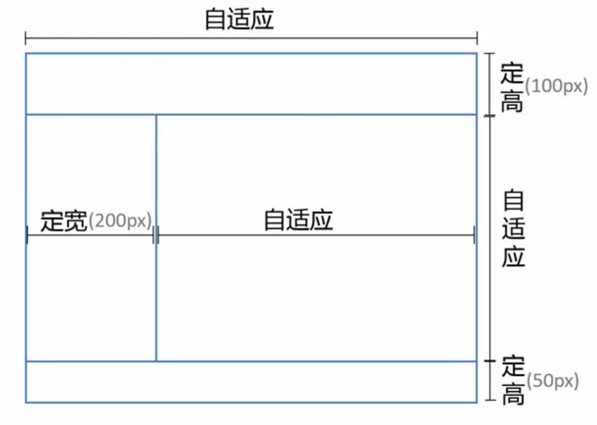
实现方案
- Position 常规方案
- Flex CSS3 新实现
Position
<div class="parent">
  <div class="top"></div>
  <div class="left"></div>
  <div class="right">
    /*辅助结构用于滚动*/
    <div class="inner"></div>
  </div>
  <div class="bottom"></div>
</div>
<style>
  html,
  body,
  .parent {
    height: 100%;
    /*用于隐藏滚动条*/
    overflo: hidden;
  }
  .top {
    /*相对于 body 定位*/
    position: absolute;
    top: 0;
    left: 0;
    right: 0;
    height: 100px;
  }
  .left {
    position: absolute;
    left: 0;
    top: 100px;
    bottom: 50px;
    width: 200px;
  }
  .right {
    position: absolute;
    left: 200px;
    right: 0;
    top: 100px;
    bottom: 50px;
    overflow: auto;
  }
  .right .inner {
    /*此样式为演示所有*/
    min-height: 1000px;
  }
  .bottom {
    position: absolute;
    left: 0;
    right: 0;
    bottom: 0;
    height: 50px;
  }
</style>
Position 兼容
此方法不支持 IE6 可以使用下面的方法解决兼容问题。
<div class="g-hd"></div>
<div class="g-sd"></div>
<div class="g-mn"></div>
<div class="g-ft"></div>
<style>
  html,
  body {
    width: 100%;
    height: 100%;
    overflow: hidden;
    margin: 0;
  }

  html {
    _height: auto;
    _padding: 100px 0 50px;
  }

  .g-hd,
  .g-sd,
  .g-mn,
  .g-ft {
    position: absolute;
    left: 0;
  }

  .g-hd,
  .g-ft {
    width: 100%;
  }

  .g-sd,
  .g-mn {
    top: 100px;
    bottom: 50px;
    _height: 100%;
    overflow: auto;
  }

  .g-hd {
    top: 0;
    height: 100px;
  }

  .g-sd {
    width: 300px;
  }

  .g-mn {
    _position: relative;
    left: 300px;
    right: 0;
    _top: 0;
    _left: 0;
    _margin-left: 300px;
  }

  .g-ft {
    bottom: 0;
    height: 50px;
  }
</style>
Flex
<div class="parent">
  <div class="top"></div>
  <div class="middle">
    <div class="left"></div>
    <div class="right">
      <div class="inner"></div>
    </div>
  </div>
  <div class="bottom"></div>
</div>
<style media="screen">
  html,
  body,
  parent {
    height: 100%;
    overflow: hidden;
  }

  .parent {
    display: flex;
    flex-direction: column;
  }

  .top {
    height: 100px;
  }

  .bottom {
    height: 50px;
  }

  .middle {
    // 居中自适应
    flex: 1;
    display: flex;
    /*flex-direction: row 为默认值*/
  }

  .left {
    width: 200px;
  }

  .right {
    flex: 1;
    overflow: auto;
  }
  .right .inner {
    min-height: 1000px;
  }
</style>
Flex 兼容性
CSS3 中的新概念所有 IE9 及其也行版本都不兼容。
百分比宽度需求
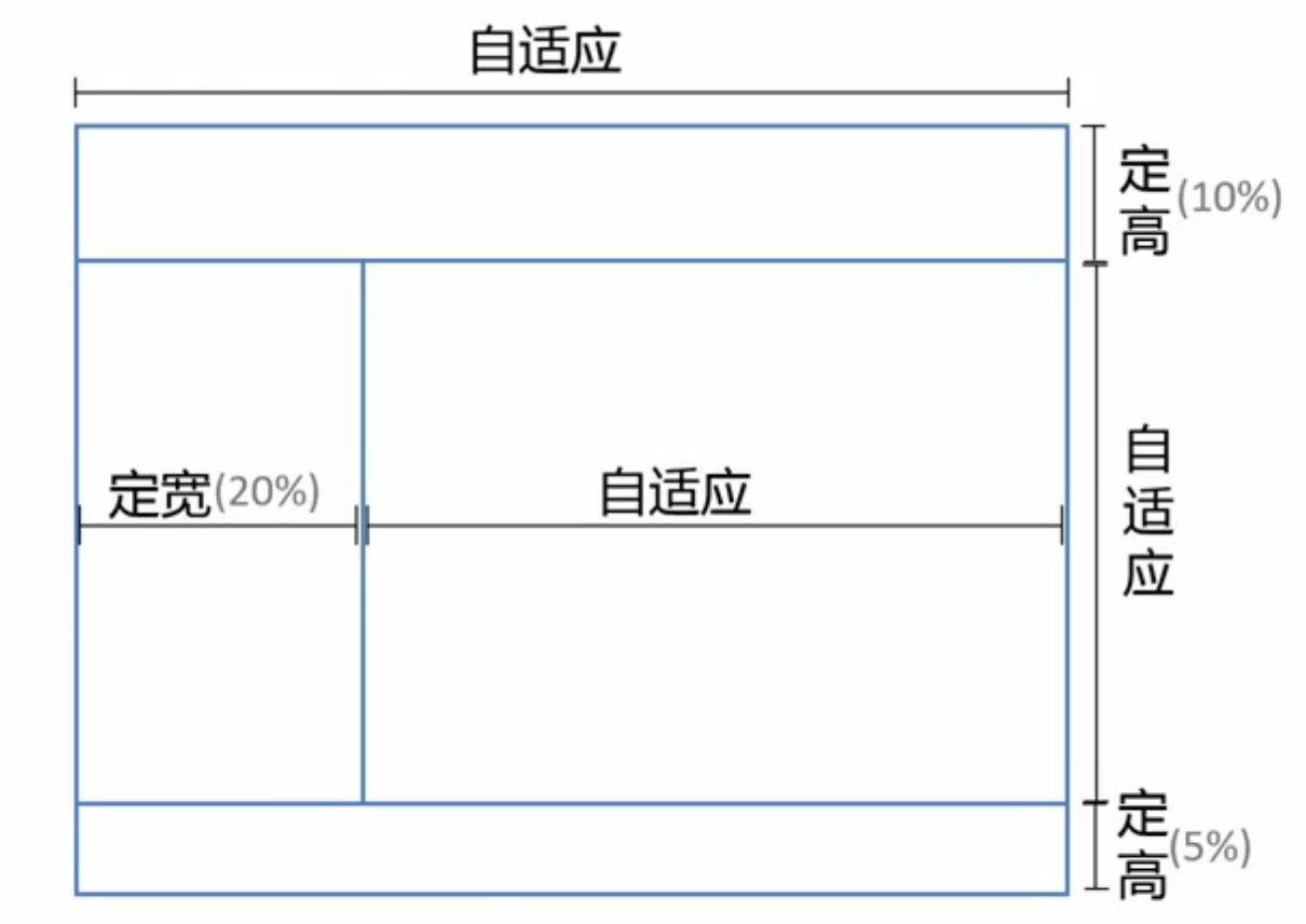
只需把定宽高(px 为单位的值)的实现改成百分比(%)既可。
内容自适应
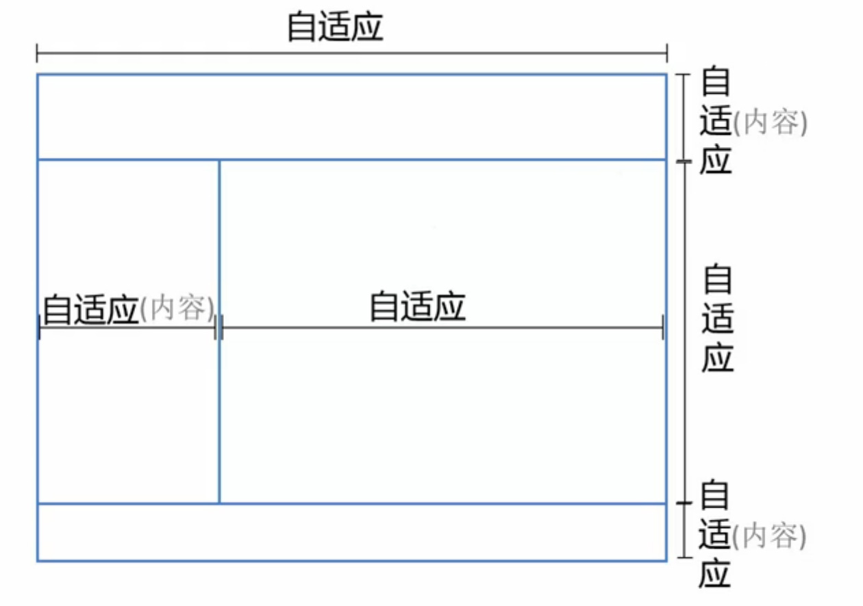
只有右侧栏占据剩余位置,其余空间均需根据内容改变。 所以 Postion 的定位方法不适合实现此方案。下面列出了两种布局方案:
- Flex
- Grid,W3C 草案并不稳定,浏览器支持也并不理想
Flex
只有不为宽高做出限制,既可对其中的内容做出自适应的布局。
<div class="parent">
  <div class="top"></div>
  <div class="middle">
    <div class="left"></div>
    <div class="right">
      <div class="inner"></div>
    </div>
  </div>
  <div class="bottom"></div>
</div>

<style media="screen">
  html,
  body,
  parent {
    height: 100%;
    overflow: hidden;
  }

  .parent {
    display: flex;
    flex-direction: column;
  }

  .middle {
    // 居中自适应
    flex: 1;
    display: flex;
    /*flex-direction: row 为默认值*/
  }

  .right {
    flex: 1;
    overflow: auto;
  }
  .right .inner {
    min-height: 1000px;
  }
</style>
方案比较
| 方案 | 兼容性 | 性能 | 自适应 |
|---|---|---|---|
| Position | 好 | 好 | 部分自适应 |
| Flex | 较差 | 差 | 可自适应 |
| Grid | 差 | 较好 | 可自适应 |