Form Extras
Chapter 11
I have a few more surprises in store for you. We can now use a number of attributes that will help make our form more attractive. One of them is a placeholder text. Let's add it to one of the form fields, <textarea>:
<textarea rows="10" cols="50" id="content" name="content"
placeholder="Enter a comment here. Be nice and polite!"></textarea>
The effect?
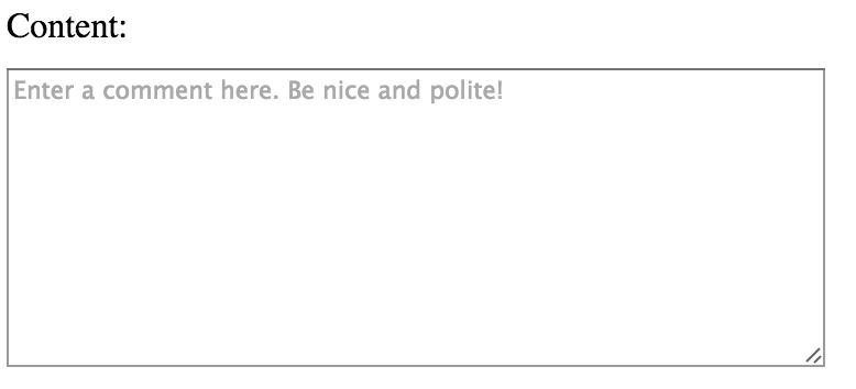
As you can see, in the middle of <textarea>, text has appeared with an additional description of this field, which corresponds to what we put in the attribute "placeholder". Peace of mind, when you click this text will disappear and you will be able to enter your own content. If you leave the field blank is also nothing will happen - the contents of the "placeholder" will not be sent away, it serves only to hint to the user. This attribute can also use elements <input>.
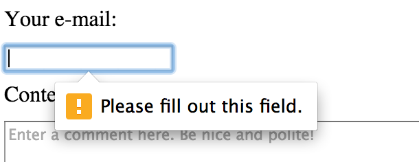
Another very useful attribute is required, which is added to the form elements without any value. For example, an e-mail will look like this:
<input type="email" id="user-email" name="user-email" required>Now, when we leave the field blank, when you send the form we will see the error:
There is plenty of useful attributes you can use together with form elements. Let's consider Google search input for a moment:
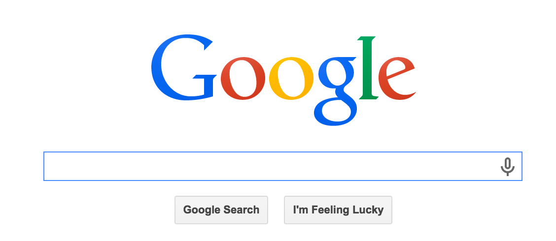
It's encoded per the following (as of April 2015):
<input id="q" aria-hidden="true" autocomplete="off" name="q" tabindex="-1" type="url" jsaction="mousedown:ntp.fkbxclk" style="opacity: 0;">As you can see, the element input has a bit more than the usual attributes we used. Try for yourself to find the HTML specifications for each of them. Even Google will help you here :).
Attributes are also useful for transmitting elements from CSS. For example, each element input with the attribute "type" equal to "text", as shown below:
input[type="text"] {
  border: 1px solid blue;
}
In the example above, each element input has the attribute "type" equal to "text" with the value of a blue frame:
Similarly, we can use the same for the email field:
input[type="text"] {
  border: 1px solid blue;
}

input[type="email"] {
  border: 1px solid blue;
}
Everything should now look like this:
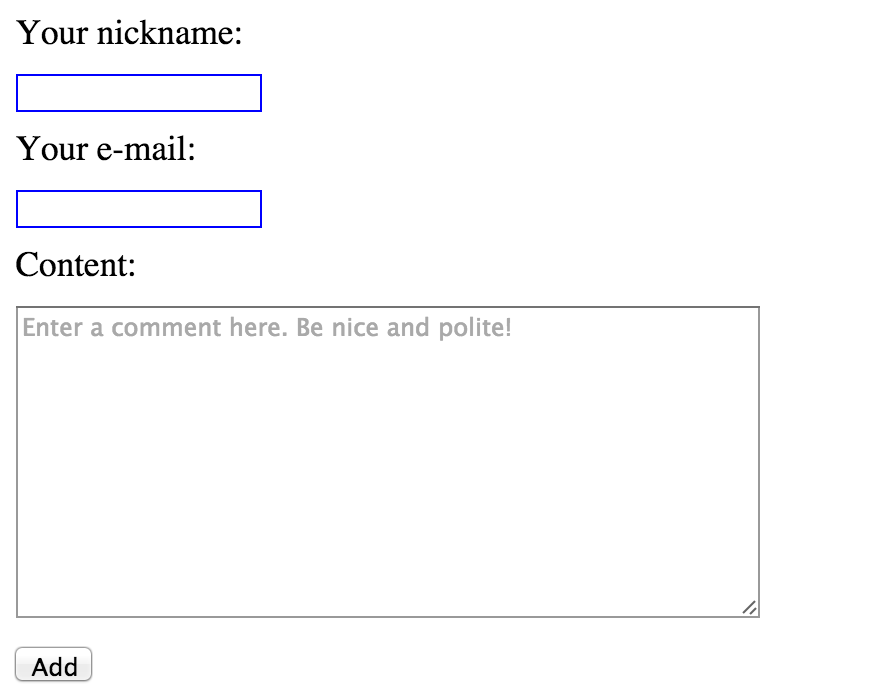
As you can see, we've created two selectors in CSS which give the same value, specifically for "border." If we wanted to use something like this for a larger number of elements, we would probably copy one of those selectors and modify it slightly. As a result, we would have more independent selectors doing the same thing (i.e. setting borders). In CSS, you can shorten the operation, listing selectors after a comma to form a group.
input[type="text"],
input[type="email"] {
  border: 1px solid blue;
}
You can see that we saved space and simplified our code to have better clarity. Using our previous example, all combinations are possible selectors that we want to group:
.news-item,
article p,
#main header h1 {
  padding: 5px;
  margin: 5px;
}
Always keep in mind grouping selectors allows you to repeat certain values for several elements. This way, you have one piece of code for multiple elements in the HTML, and you won't have to look too far in the CSS file to make modifications.