Multi-Column Layout
Chapter 12
In the previous example, we learned, among other things, the <div> tag. You know that they have no semantic meaning and serve primarily as a container for other blocks. Usually you add them to apply various visual changes through CSS for larger parts of the website that resemble boxes or rectangles.
So far, we have managed to get a view of the article, create a menu, and a comment form. Let's put them all together in a 3-column layout with the menu on the left, article and comment forms in the middle, and a list of materials related to the article on the right. Let's assume that the whole of this page is 960 pixels wide, centered.
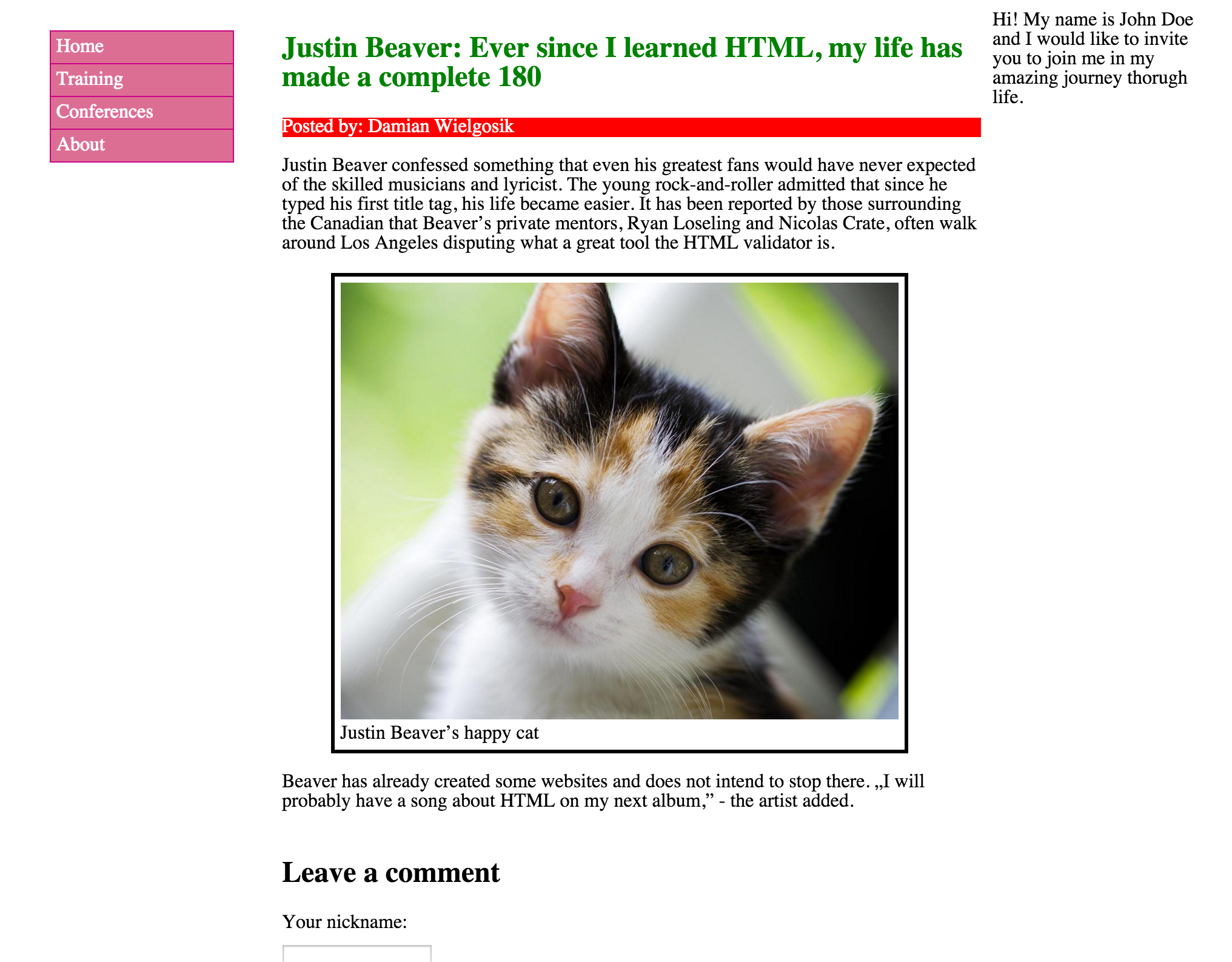
Let's try again to identify what we see in the graphic, functional parts, which are mapped by HTML. We have the left column which contains the menu. The central column contains the main content of the page. The right column contains a short text.
Let's start from the container that holds these three columns. As we noted earlier, we want all of them to be contained within a space no wider than 960 pixels. HTML does not have social tags for such a circumstance, we we'll use our old friend, the <div> tag.
<div class="main-container"></div>We have just given <div> the class main-container which says that this is the main container for other item on our website.
Now to add the place for menu. It will be included in <div class="site-menu">:
<div class="main-container">
  <nav class="site-menu"></nav>
</div>
Moving forward, we place the container for the main content in the middle of the column:
<div class="main-container">
  <nav class="site-menu"></nav>
  <div class="main-content"></div>
</div>
And now the right column, or "sidebar":
<div class="main-container">
  <nav class="site-menu"></nav>
  <div class="main-content"></div>
  <aside class="sidebar"></aside>
</div>
Now let's analyze our next step based on the picture. What content should the left-column contain? As the name suggests, this should be our menu from the previous exercises:
<div class="main-container">
  <nav class="site-menu">
    insert menu code here
  </nav>
  <div class="main-content"></div>
  <aside class="sidebar"></aside>
</div>
I've put placeholder text inside of the <nav> tag for the menu code to preserve readability. When we are ready to publish our website, we will simply copy the code from our menu and paste it between <nav> and </nav>.
The middle column will contain the article and comment form:
<div class="main-container">
  <nav class="site-menu">
    insert menu code here
  </nav>
  <div class="main-content">
    <article>insert article code here</article>
    <form>insert form code here</form>
  </div>
  <aside class="sidebar"></aside>
</div>
For the right column, we'll put a side item unrelated to the main content, using the tag <aside>:
<div class="main-container">
  <nav class="site-menu">
    insert menu code here
  </nav>
  <div class="main-content">
    <article>insert article code here</article>
    <form>insert form code here</form>
  </div>
  <aside class="sidebar">
    <div>insert sidebar code here</div>
  </aside>
</div>
Ok, our HTML is ready. Now it's time for CSS. Our first task is to set the maximum width for the main container with class "main container":
.main-container {
  max-width: 960px;
}
We've given it the property max-width, so whatever happens, the width of the entire container named with a class main-container will never be wider than 960 pixels.
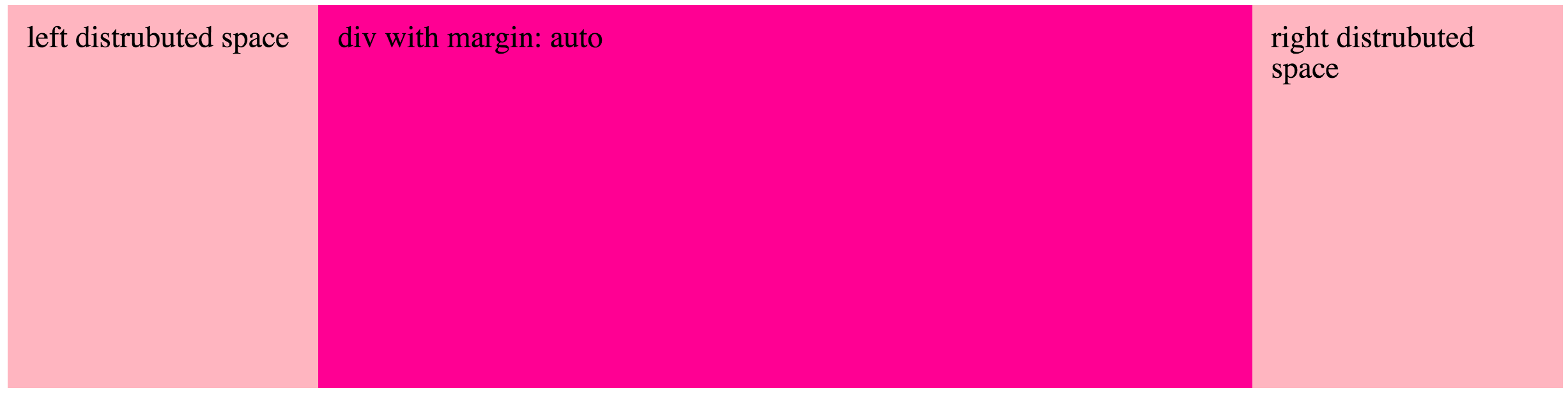
Next to center the block. This is done by setting automatic margins:
.main-container {
  max-width: 960px;
  margin: auto;
}
With this code, the browser will take up all free space around .main-container and distribute the space equally between the two margins.
We now have all the code responsible for the main container. Let's proceed to code our three columns. Let the container of the menu have 20% of the available width. This is done simply by specifying a percentage value:
.site-menu {
  width: 20%;
}
And a similar width for the right-hand column:
.sidebar {
  width: 20%;
}
Since the left and right column have the same properties, we can group them with a comma:
.site-menu,
.sidebar {
  width: 20%;
}
Now let's get to the middle column. It will take the remaining width (60%), as the two side columns occupy a total of 40%.
.main-content {
  width: 60%;
}
Unfortunately, our containers still appear in a block (one above the other). To set them next to each other, we need to give them a special CSS float property. We use it to tell the browser that we want X item closer to the left or right edge of the container in which it is placed. When one container has elements "floated" to the left edge, they will set up next to each other and we can cleverly take advantage of this mechanic.
This is because the left-hand column "sticks" to the left edge of the main container.
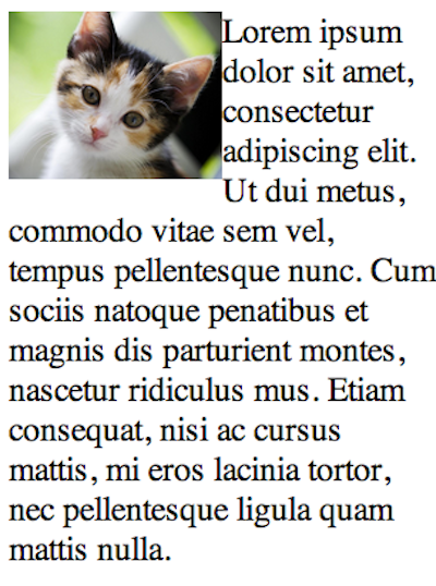
Before we get to use CSS float, however, I want to show you the most common use case of this property. Imagine that you have an image set directly within text:
<p><img src="cat.jpg" alt="angry cat is watching you">Lorem ipsum dolor sit amet, consectetur adipiscing elit. Ut dui metus, commodo vitae sem vel, tempus pellentesque nunc. Cum sociis natoque penatibus et magnis dis parturient montes, nascetur ridiculus mus. Etiam consequat, nisi ac cursus mattis, mi eros lacinia tortor, nec pellentesque ligula quam mattis nulla.</p>By default, it looks like that:
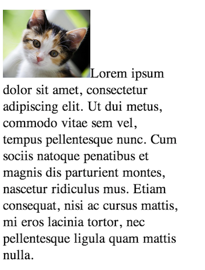
This happens because the tag <img> is is a "line" component, so it was inserted at the beginning of the line and the text will simply follow it.
However, if we set the image to "float" to the "right" we will see something much better:
img {
  float: right;
}
The picture is now "floating" on the right edge of the text in which it was placed. In this case, the edges of the paragraph <p>.
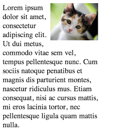
Now let's set float to left:
As you can see, the picture is now "floating" to the left edge of the paragraph, and the text wrapped around it on the right side.
Returning to our columns, we can do the same thing with to all columns that we want to position "left" at the edge of the container. Notice that we're about to float all containers as grouped with commas:
.site-menu,
.main-content,
.sidebar {
  float: left;
}
Bingo! See how our browser now displays the elements:

Let's analyze what happened after we "floated left." Each element will attempt to float left in terms of their priority in the list. So in this case, .site-nav took the leftmost edge, and .main-content was next in line to fill in the left-most space. Finally, the .sidebar filled in the last "left" edge, completing the arrangement.
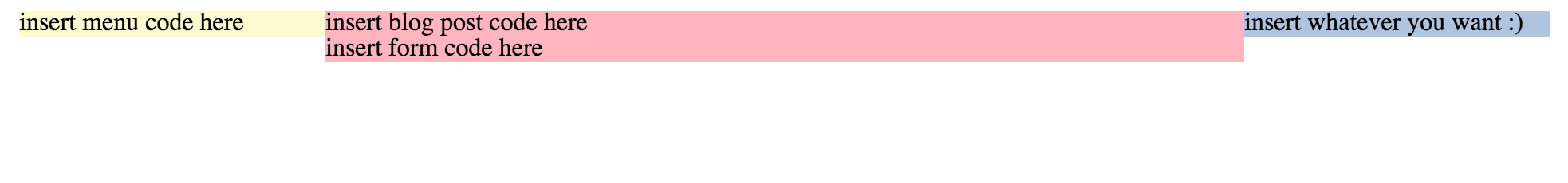
Awesome! We've just obtained a multi-column arrangement. To further illustrate this topic, let's add background colors for each column:
.main-content {
  width: 60%;
  background-color: LightPink;
}

.site-menu {
  background-color: LightGoldenRodYellow;
}

.sidebar {
  background-color: LightSteelBlue;
}
The effect is satisfactory. The following result shows that we managed to divide the main container columns correctly:
Our final CSS code looks like this:
.main-container {
  max-width: 960px;
  margin: auto;
}

.site-menu,
.main-content,
.sidebar {
  float: left;
}

.site-menu,
.sidebar {
  width: 20%;
}

.main-content {
  width: 60%;
  background-color: LightPink;
}

.site-menu {
  background-color: LightGoldenRodYellow;
}

.sidebar {
  background-color: LightSteelBlue;
}
With this code, we've created a simply layout with three columns. Now, you just need to paste the remaining HTML and CSS code from our previous exercises and our job is done!
You have completed your first website!