Differences Between <div> and <span>
Chapter 10
The elements from last chapter appear one after the other on the same horizontal line. These elements are behaving as plain text, and will just be displayed one next to the other, even though they have certain sizes and other properties that don't apply to texts. It shouldn't be surprising, as <label>, <input>, and <textarea> are all elements of one group called inline-block. Inline-block elements can have different sizes, however browser will always display them horizontally just as a text. In this chapter we will learn about different groups of elements according to how they are laid out on the page.
First, let's figure out how one makes elements display one after the other vertically. We basically need to tell the browser, "Hey, we want a container which can be vertically stacked". Fortunately, this container tag is known as <div>, and will sort of "break" content to new lines (like page breaks or line breaks in word processors).
To see how the <div> elements work, let's use three of these and let's set them width, height, and background.
Under the assumptions given above, the HTML will look like this:
<div class="container"></div>
<div class="container"></div>
<div class="container"></div>
In CSS, we write the class ".container" when referring to the <div> tag.
.container {
  width: 200px;
  height: 200px;
  background-color: blue;
}
Let's see this in a browser:
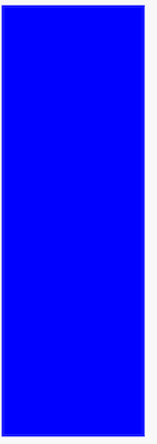
Looks like a one big rectangle. What about separating <div> tags 10 pixels from the bottom?
.container {
  width: 200px;
  height: 200px;
  background-color: blue;
  margin-bottom: 10px;
}
I added a margin-bottom property (highlighted above) to separate each <div> by 10 pixels from the bottom. Now it's time to check the effect in the browser:

Great! The browser displays these "blocks" one by one, in contrast to our previous example of a web form where the elements appeared on the same line.
Why is this different? When it comes to the display of tags, the browser recognizes three groups of elements:
- inline
- block-level
- inline block-level
Inline elements do not cause transitions to a new line, but will be displayed one next to the other horizontally. Block elements are set like blocks that stack on top of each other and will never display next to one another horizontally, unless we use magic tricks in CSS (which we'll learn in the next chapter). Inline blocks will act as inline elements (elements are displayed next to each other), but differ in that they can be for instance resized. For example, the <textarea> field can be displayed as a large rectangle, but it can take up space beyond a single line of text.
Let me share with you some examples of items that can be classified according to one of the three groups.
- inline – <span>, <em>, <strong>
- block-level – <div>, <p>, <article>
- inline block-level – <input>, <textarea>
By default, inline elements have CSS display property set to inline. For block-level elements, its value is "block", and for inline block elements it's "inline-block". So you can explain that <span> tag doesn't cause breaking the text to the new line, because it's an inline element which means in CSS it has property "display" set to "inline". So, considering the below code:
<span>one</span> <span>two</span> <span>three</span>The browser will display above code in one line:
one two trhee
However, it's possible to change this behavior by adding one line of CSS:
span {
  display: block;
}
Now, our <span> tags display differently, each one in a new line, since we ave set their display property to block:
one
two
three
For this example, we use <div>. You may wonder what this tag describes within the document. The short answer is nothing. We use the <div> tag in cases where all other tags do not find a use for what we've put in the document. It is common, therefore, that the <div> tag (in conjunction with other classes) is used to achieve different visual effects, as a result of it having no function for describing content. For example, if you want to make three vertical columns on our website, we might need an item that can separate some elements of inline or inline block elements.
In general, it's a good idea to not overuse the <div> tag if possible.
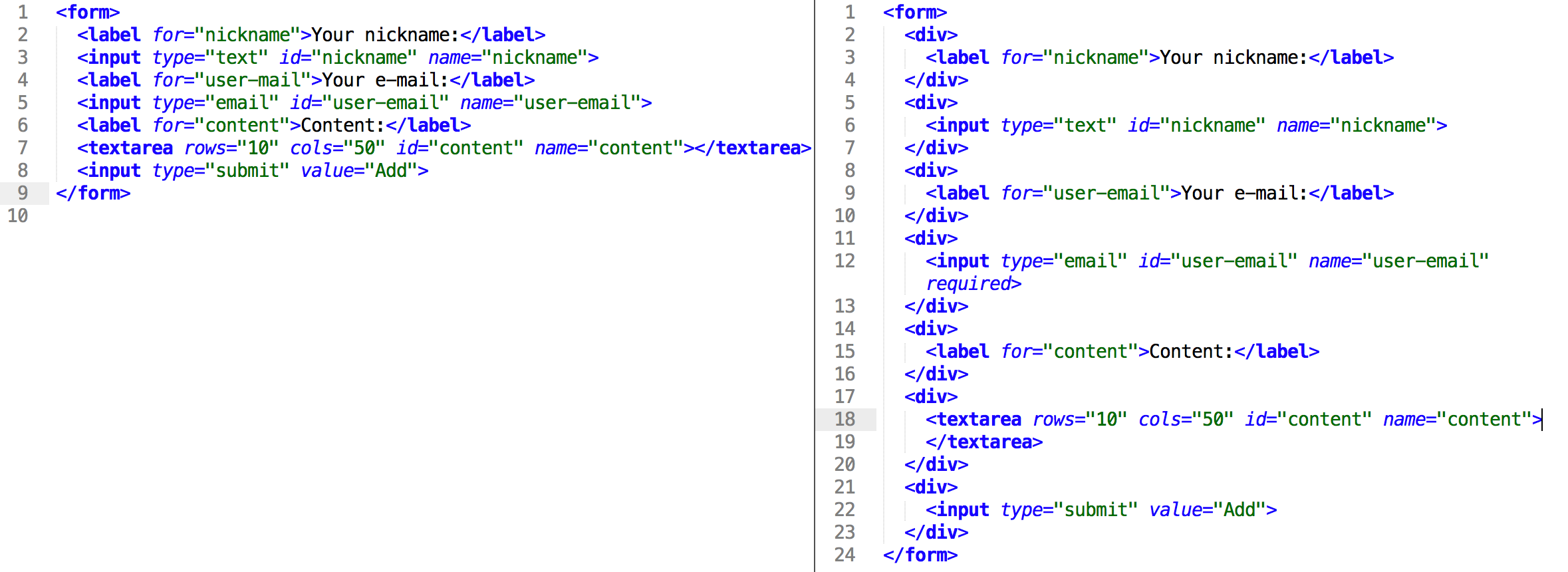
With our new found knowledge of blocks, let's make up our form code so that the form fields and their descriptions are displayed nicely one on top of the other:
<form>
  <div>
    <label for="nickname">Your nickname:</label>
  </div>
  <div>
    <input type="text" id="nickname" name="nickname">
  </div>
  <div>
    <label for="user-email">Your e-mail:</label>
  </div>
  <div>
    <input type="email" id="user-email" name="user-email">
  </div>
  <div>
    <label for="content">Content:</label>
  </div>
  <div>
    <textarea rows="10" cols="50" id="content"  name="content" ></textarea>
  </div>
  <div>
    <input type="submit" value="Add">
  </div>
</form>
It looks a bit more complicated, but the only thing we've done here is add <div> tags to surround each of the elements on the form.
Once again, let's look at a code comparison of our new code (left) against the old one (right):
And now see how the new code displays in your browser!
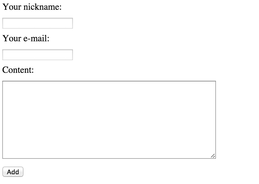
Our form looks excellent now!