Websites and Legos
Chapter 1
I really like The Verge. It's a website where you can find interesting articles about new technologies, science and culture. On the home page, you can find dozens of feature stories and articles which tend to look similar to each other. They have a title, category, date, and image entry. It almost looks like it was built with bricks.
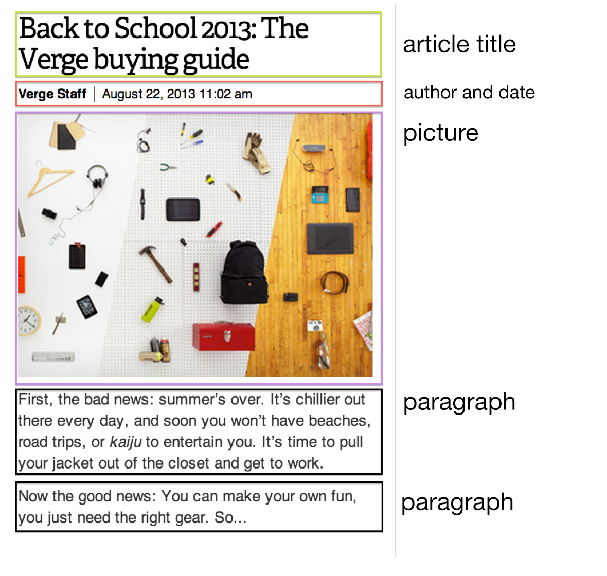
Let take a look at one of them:

At first glance, there's nothing complicated. Let's have some fun and highlight (or block out) each element, as though we were dealing with Lego parts.

In total, we've got five pieces, arranged one on top of the other.
You might remember from your childhood that in order to build something specific, you need a lot of different blocks that are useful for different things. Each of them has a certain function. For example, when building a house, one type is useful for walls, and the other more useful for floors. There is no single, universal block or element from which you can make anything that comes to mind. See the figure below? This is what a large selection of lego choices should look like, right?

The same is true with websites. When you build a website, you use the different elements according to their ideal destination. In the Verge example, it seems that we are dealing with various objects (or blocks), so doing something like applying the same color or style to each block would be counterintuitive. After all, the title is not the same as the date, or content of the paragraph. They each perform completely different functions.
In order to continue then, we need to identify elements of the article by the functions they perform on the site. Let's do this by adding a unique color to each "block."

This is much more interesting. We now have a few different types of "building blocks". Only two blocks are of the same type, specifically the two paragraphs below the picture. This is no different than organizing legos. We're going to keep together similar fragments of text that belong in the same group. As a formality, we'll name each of the sections based on their function in the context of the article.

So we've marked each element according to their semantic meaning. This is exactly the kind of behavior and logic that we can expect to see from a web browser. It's our job to tell the browser, in a way that it can understand, what each of these elements mean and how they fit together syntactically. If this is not done, then our site will appear as a clump of single text.
You might have created such pages or articles using a text editor program like Microsoft Word or Pages. In text editors, achieving effects like "header styles" is a matter of clicking a few buttons. In other words, when we select text in a word editor and press "Header 1" we are assigning a bunch of different features in the background that tell the editor to display stuff in a specific way.
Therefore, if we wanted to recreate a page like the above example in a word processor, it would be simple and easy, at which point you could probably close this book and go do something else (Breaking Bad would be a good alternative). The problem is that we want to display this article on the web, which must be displayed in a browser, and never in a text editing program.