折叠
对为支持折叠功能的组件,例如 accordions 和导航,赋予基本样式和灵活的支持。
- 插件依赖
- 折叠插件依赖过渡效果插件。
案例
使用折叠插件,通过扩展 panel 组件从而构建了一个简单的 accordion 组件。
先来看一下效果。
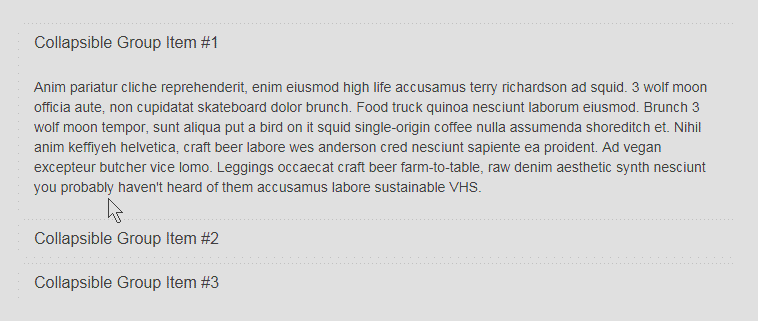
接下来看一下代码的实现。
<div class="container" style="margin-top:140px;">
     <div class="panel-group" id="accordion">
      <div class="panel panel-default">
        <div class="panel-heading">
          <h4 class="panel-title">
            <a data-toggle="collapse" data-toggle="collapse" data-parent="#accordion" href="#collapseOne"> Collapsible Group Item </a>
          </h4>
        </div>
        <div id="collapseOne" class="panel-collapse collapse in">
          <div class="panel-body"> Anim pariatur cliche reprehenderit, enim eiusmod high life accusamus terry richardson ad squid. 3 wolf moon officia aute, non cupidatat skateboard dolor brunch. Food truck quinoa nesciunt laborum eiusmod. Brunch 3 wolf moon tempor, sunt aliqua put a bird on it squid single-origin coffee nulla assumenda shoreditch et. Nihil anim keffiyeh helvetica, craft beer labore wes anderson cred nesciunt sapiente ea proident. Ad vegan excepteur butcher vice lomo. Leggings occaecat craft beer farm-to-table, raw denim aesthetic synth nesciunt you probably haven't heard of them accusamus labore sustainable VHS. </div>
        </div>
      </div>
      <div class="panel panel-default">
        <div class="panel-heading">
          <h4 class="panel-title">
            <a data-toggle="collapse" data-toggle="collapse" data-parent="#accordion" href="#collapseTwo"> Collapsible Group Item #2 </a>
          </h4>
        </div>
        <div id="collapseTwo" class="panel-collapse collapse">
          <div class="panel-body"> Anim pariatur cliche reprehenderit, enim eiusmod high life accusamus terry richardson ad squid. 3 wolf moon officia aute, non cupidatat skateboard dolor brunch. Food truck quinoa nesciunt laborum eiusmod. Brunch 3 wolf moon tempor, sunt aliqua put a bird on it squid single-origin coffee nulla assumenda shoreditch et. Nihil anim keffiyeh helvetica, craft beer labore wes anderson cred nesciunt sapiente ea proident. Ad vegan excepteur butcher vice lomo. Leggings occaecat craft beer farm-to-table, raw denim aesthetic synth nesciunt you probably haven't heard of them accusamus labore sustainable VHS. </div>
        </div>
      </div>
      <div class="panel panel-default">
        <div class="panel-heading">
          <h4 class="panel-title">
            <a data-toggle="collapse" data-toggle="collapse" data-parent="#accordion" href="#collapseThree"> Collapsible Group Item #3 </a>
          </h4>
        </div>
        <div id="collapseThree" class="panel-collapse collapse">
          <div class="panel-body"> Anim pariatur cliche reprehenderit, enim eiusmod high life accusamus terry richardson ad squid. 3 wolf moon officia aute, non cupidatat skateboard dolor brunch. Food truck quinoa nesciunt laborum eiusmod. Brunch 3 wolf moon tempor, sunt aliqua put a bird on it squid single-origin coffee nulla assumenda shoreditch et. Nihil anim keffiyeh helvetica, craft beer labore wes anderson cred nesciunt sapiente ea proident. Ad vegan excepteur butcher vice lomo. Leggings occaecat craft beer farm-to-table, raw denim aesthetic synth nesciunt you probably haven't heard of them accusamus labore sustainable VHS. </div>
        </div>
      </div>
    </div>
</div>- 第一步:首先最外面那层 panel-group 这层下面包括几个小组。
- 第二步:看一下几个简单的组
<div class="panel panel-default">
    <div class="panel-heading">
      <h4 class="panel-title">
        <a data-toggle="collapse" data-toggle="collapse" data-parent="#accordion" href="#collapseOne"> Collapsible Group Item #1 </a>
      </h4>
    </div>
    <div id="collapseOne" class="panel-collapse collapse in">
      <div class="panel-body">
      </div>
    </div>
</div>
通过代码也比较清楚的可以看出一个 panel 的结构。
panel-header 和 pandl-body,然后 panel-header 里面可以包含标题,链接。通过链接和 panel-body 相连。
- 第三步:你可以发现在
panel-group中有一个id="accordion",然后下面每个标题下链接中有个data-parent="#accordion"。
如果去掉的话,那么效果就是点击其他链接后,原来的 panel 并不会再缩起来了。
你可以通过另一个方式来展示折叠的效果。
<div class="container" style="margin-top:140px;">
 <button type="button" class="btn btn-danger" data-toggle="collapse" data-target="#demo"> simple collapsible </button>

<div id="demo" class="collapse in">Anim pariatur cliche reprehenderit, enim eiusmod high life accusamus terry richardson ad squid. 3 wolf moon officia aute, non cupidatat skateboard dolor brunch. Food truck quinoa nesciunt laborum eiusmod. Brunch 3 wolf moon tempor, sunt aliqua put a bird on it squid single-origin coffee nulla assumenda shoreditch et. Nihil anim keffiyeh helvetica, craft beer labore wes anderson cred nesciunt sapiente ea proident. Ad vegan excepteur butcher vice lomo. Leggings occaecat craft beer farm-to-table, raw denim aesthetic synth nesciunt you probably haven't heard of them accusamus labore sustainable VHS.</div>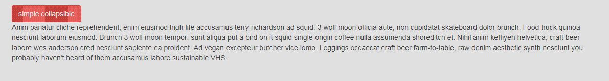
用法
折叠插件通过几个简单的类来控制样式
- .collapse 隐藏内容
- .collapse in 显示内容
- .collapsing。 折叠被添加后过渡效果就有了,然后如果被移除了它就结束了。
通过 data 属性
仅仅通过向页面元素添加data-toggle="collapse" 和data-target就可以为其赋予控制可折叠页面元素的能力。data-target属性接受一个CSS选择器作为其控制对象。请确保为可折叠页面元素添加collapse class。如果你希望可折叠页面元素的默认状态是展开的,请添加in class。
为了给一组可折叠页面元素添加控制器,添加 data-parent="#selector" 即可。请参考上面的例子即可。
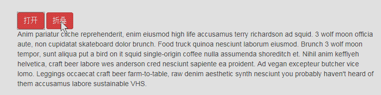
通过 JavaScript
<button type="button" class="btn btn-danger" onClick="Open()">打开</button>
<button type="button" class="btn btn-danger" onClick="Hide()">折叠</button>

<div id="demo" class="collapse in">Anim pariatur cliche reprehenderit, enim eiusmod high life accusamus terry richardson ad squid. 3 wolf moon officia aute, non cupidatat skateboard dolor brunch. Food truck quinoa nesciunt laborum eiusmod. Brunch 3 wolf moon tempor, sunt aliqua put a bird on it squid single-origin coffee nulla assumenda shoreditch et. Nihil anim keffiyeh helvetica, craft beer labore wes anderson cred nesciunt sapiente ea proident. Ad vegan excepteur butcher vice lomo. Leggings occaecat craft beer farm-to-table, raw denim aesthetic synth nesciunt you probably haven't heard of them accusamus labore sustainable VHS.</div> <div class="panel-group" id="accordion" style="margin-top:240px;">
<script type="text/javascript"> $(function(){
$("#demo").collapse({
toggle: false })
})
function Open(){
$("#demo").collapse("show");
}
function Hide(){
$("#demo").collapse("hide");
} </script>来看一下上面的效果
方法
赋予页面元素可折叠功能。接受一个可选的 object 作为参数。
$("#demo").collapse({toggle: false})这样元素在初始化的时候会是展开的。
- collapse('toggle')展示或隐藏一个可折叠的页面元素。
- collapse('show')展示一个可折叠页面元素。
- collapse('hide')隐藏一个可折叠页面元素。
事件
Bootstrap 中的折叠插件对外暴露了一组可以监听的事件。

$('#demo').on('hidden.bs.collapse', function () {
          alert(1);
    })
这样就为元素绑定了隐藏时的事件。