Menu, Please!
Chapter 6
Another popular part of websites is menu. Basically, it's a list of items which are often just simple links pointing to other places on the site. Let's implement it! We will start with the following HTML code:
<!DOCTYPE html>
<html lang="en">
  <head>
      <meta charset="utf-8">
      <title>Menu</title>
      <link rel="stylesheet" href="main.css" media="screen">
  </head>
  <body>
    <nav>
      <ul>
        <li>
          <a href="index.html">Home</a>
        </li>
        <li>
          <a href="training.html">Training</a>
        </li>
        <li>
          <a href="conferences.html">Conferences</a>
        </li>
        <li>
          <a href="about.html">About us</a>
        </li>
      </ul>
    </nav>
  </body>
</html>
Our menu will consist of four items:
- Home
- Training
- Conferences
- About us
We want it to look something like this:
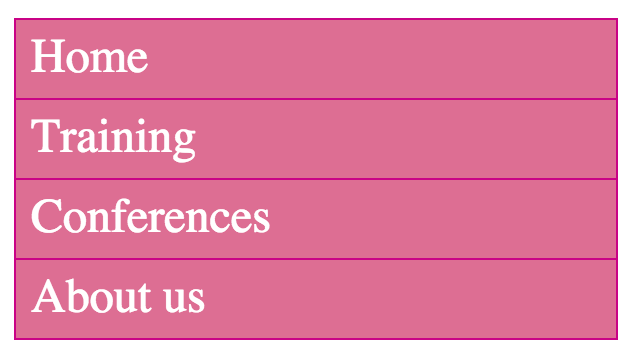
You might notice that under the
tag, we've added the new tags <nav>, <ul>, and <li>.<nav> is used for specifying all kinds of navigation functions on websites that contain links to internal or external information. So putting <nav> into the code says "everything inside
Within <nav>, we place the <ul> tag followed by several <li> tags. The tag <ul> represents an "unordered list" (like a bullet list) and the <li> tags represent each individual component of that list (single bullet). When creating websites, it's common that an unordered list will be the most reasonable choice when it comes to mapping menu pages. In fact, the menu is kind of a list of links that has been created without a predetermined rule as to the order of its elements.
With just the code above that is still unfinished, our list should be displayed as follows:
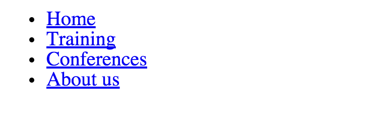
You might have seen something similar, even when creating a text document on a word processor, when you want to create a list with bullets. Without CSS <ul>, however, our list would simply begin with a ".". In contrast, our menu can be much more complex. We can give it a border, color, background, etc. Each link is by default displayed in blue as seen in the image above.
Let's now try to produce a more stylized menu in our CSS code.
Normally, we start from the most general tag in the HTML code, right? In this case, that top-most code begins with <nav> since this is responsible for our navigation menu. Within this tag, there is not much to do since this tag does not deal directly with the changes of appearances for the bullet list.
The next tag is then <ul>, which begins the unordered list. We want our list to be displayed slightly differently than the default. The most important thing is to have a new background:
nav ul {
  background-color: PaleVioletRed;
}
For the background color we chose the name PaleVioletRed. Reloading the page shows our changes as a result of adding this code.
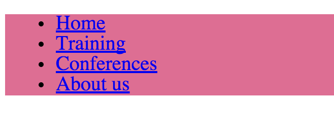
Indeed, we've applied the color cyan as the background for the entire element of <ul>. This is because we applies it to <nav> and <ul> tags, as per the following selector.
nav ul {}Now we want to get rid of the black, round dots in this list to make it look more like a menu. We can hide it, thanks to the property "list-style" as shown below:
nav ul {
  background-color: PaleVioletRed;
  list-style: none;
}
Setting list-style to none makes the list have no distinguishing marks.
It looks much better:
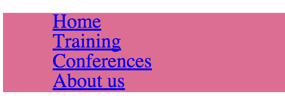
The large swath of color is surprisingly big. We're going to trim it down a bit using the same exercise as the image border earlier (e.g. padding).
nav ul {
  background-color: PaleVioletRed;
  list-style: none;
  padding: 0;
}
As you can see below, it looks much better now, slowly approaching a nice form:
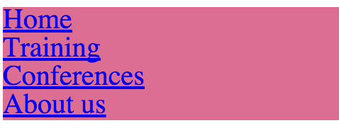
Now it's time to work on the dimensions. Our navigation has to be 200 pixels wide:
nav ul {
  background-color: PaleVioletRed;
  list-style: none;
  padding: 0;
  width: 200px;
}
At the end, we'll add a border to the list exactly like the image. It will be expressed as a solid line, with a 1 pixel width, and a "light blue" color:
nav ul {
  background-color: PaleVioletRed;
  list-style: none;
  padding: 0;
  width: 200px;
  border: 1px solid MediumVioletRed;
}
Here's the result and it's looking great!
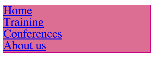
So there is our beautiful outer frame. Time to frame each individual item in the list, which can be addressed using the following CSS selector:
nav ul li {}And so this code looks at <nav>, <ul> and then <li>. What seems to be off is that each item in the list needs its own border:
nav ul li {
  border-bottom: 1px solid MediumVioletRed;
}
With this code, we've added a border-bottom, so every <li> item now has the same border type as the outer border, on the bottom portion of the text.
Currently, our menu should look like this:
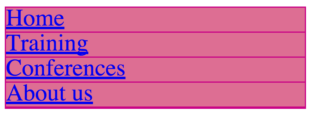
We now have two problems. The first is the left-side spacing between the border and the elements list. Let's change it using our friend "padding":
nav ul li {
  border-bottom: 1px solid MediumVioletRed;
  padding: 5px;
}
It's much better, right? We've added a 5 pixel wide padding between the text and the borders.
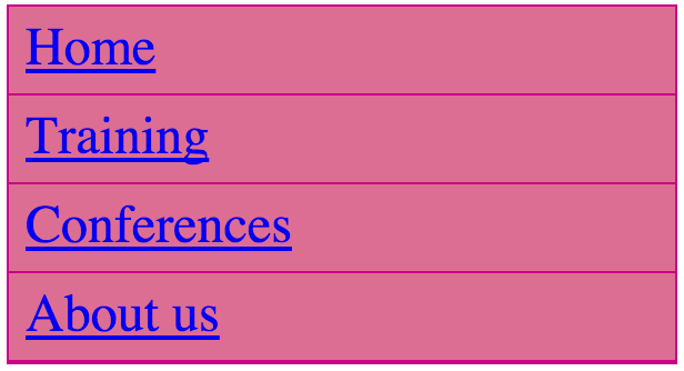
Our second problem is less visible, but still exists as a double-line at the bottom of our menu. This is because our border code for the menu is adding to our border code for the last item when we added a "bottom-border." Remember that we used the code in <ul> of <nav> to specify a border:
nav ul {
  background-color: PaleVioletRed;
  list-style: none;
  padding: 0;
  width: 200px;
  border: 1px solid MediumVioletRed;
}
And also remember that we set the list-style to "none" so that bullets or any others signs don't appear:
list-style: none;So by setting "none" as a value we sort of disabling a property so it won't have any graphical effect.
Let's do the same thing, only using the property "bottom-border" and setting the value to "none." However, we want to target only the last item in the menu, so that its bottom border does not conflict with the larger bottom border.
nav ul li:last-child {
  border-bottom: none;
}
The result of applying this code is super effective:
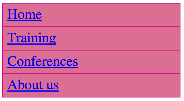
The double-border has disappeared, all because we looked at the "last-child" property in <ul> of <nav>, and then we've chosen the last <li> in it and turned off the bottom border. The pseudo-selector is "last-child" which indicates the last item in the list.
nav ul li:last-child {}This selector can be translated as follows:
"Look at <nav>, then <ul>, and apply all changes to the "last" <li> element.
The last thing we need to do is to adjust the text in the links. You create links in HTML as follows:
<a href="url">Text entered here will take you to the specified web address</a>We're using the <a> tag along with the attribute href. The value for this attribute should be the address to which you want to move the user if he or she clicks on the link. In our example, we have four links. One of them looks like this:
<a href="training.html">Training</a>This means that the browser will show the word "Training" which can be clicked on and then sends the browser to the page that has been saved in the file "training.html."
Knowing that this tag is a part of HTML code, we can create a special CSS selector that looks specifically for this tag:
nav ul li a {}Voilà!
Let's add new properties to our new selector. First of all, let's change the font color to white.
nav ul li a {
  color: white;
}
Refreshing the browser shows our new changes:
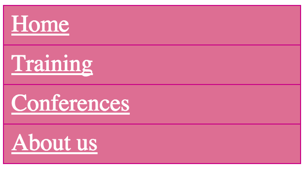
Great! We now have white color links. Now let's change some emphasis marks. The browser is set to highlight all links in the form of "text-decoration: underline" in CSS. We want to change this value, just like we did before by using the value "none."
nav ul li a {
  color: white;
  text-decoration: none;
}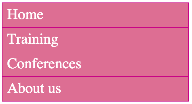
Beautiful! We have completed the menu that we wanted.
As a side note, if you are working with many links, you might remember that on many pages when you hover over a link, the text becomes emphasized somehow.
Check out this link I posted on my Twitter (without an underline):

When a mouse hovers over this link, something interesting happens that many internet users know well—the text becomes emphasized, or in this case, underlined:

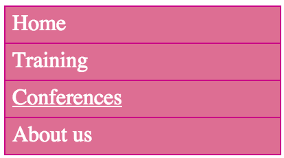
Let's try to do something similar in our menu that will allow a link to be highlighted or emphasized whenever we hover over it. We'll use a pseudo-selector called "hover":
nav ul li a:hover {
  text-decoration: underline;
}
This time we added it to the links <a>. This means when you mouse over a link, the effect will be applied. This applies to hovering over other elements as well:
div:hover
li:hover
img:hover
The effect is seen below when we hover over the "Conferences" link.
In summary, the final CSS code should look like this:
nav ul {
  background-color: PaleVioletRed;
  list-style: none;
  padding: 0;
  width: 200px;
  border: 1px solid MediumVioletRed;
}

nav ul li {
  border-bottom: 1px solid MediumVioletRed;
  padding: 5px;
}

nav ul li:last-child {
  border-bottom: 0;
}

nav ul li a {
  color: white;
  text-decoration: none;
}

nav ul li a:hover {
  text-decoration: underline;
}
The newly emerged pseudo-selectors (last-child and hover) will be useful in the future.
By the way, in this chapter you have learned how to use links and put them into HTML documents. At this point, we have used only addresses pointing to the local files (like training.html) saved on your computer, however you can also use links referring to external websites living on the web like this:
<a href="http://twitter.com/varjs">My Twitter</a>The above code in the browser will be displayed as My Twitter. Note that the address contains "http://" at the very begininng. It's a rule to learn that every link you used in a HTML document that points to another website, must be prefixed by "http://". Otherwise, your links won't redirect users to the places they should.